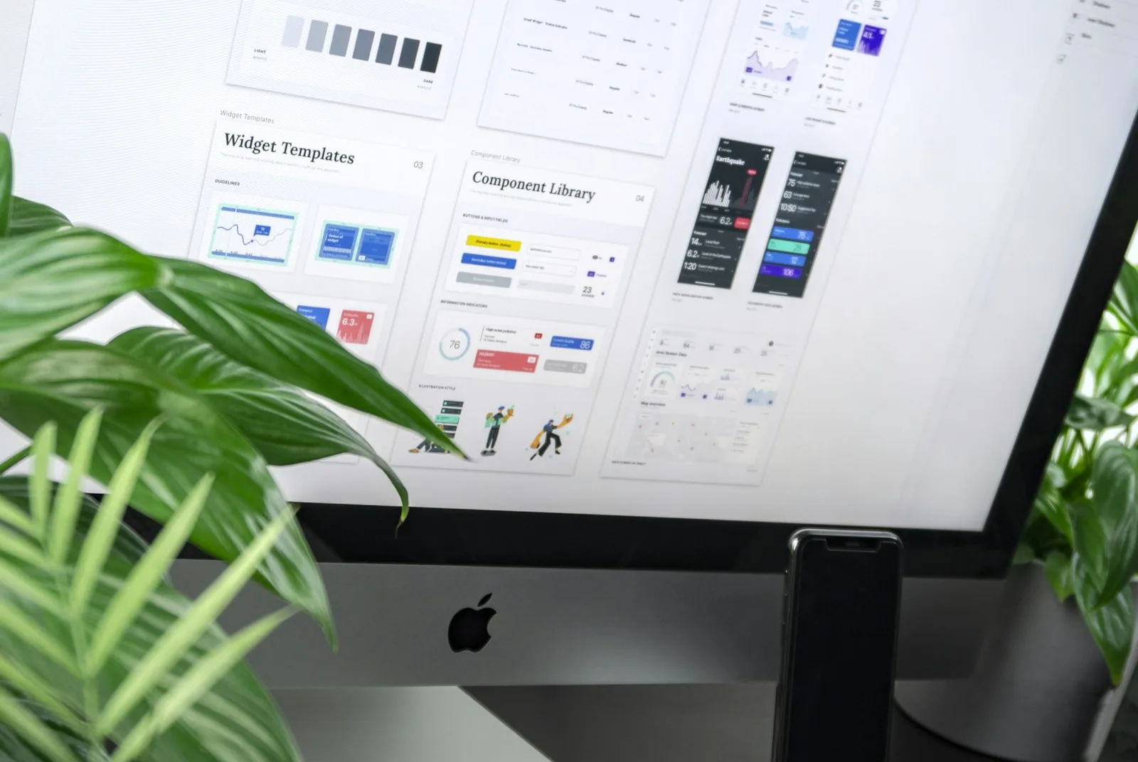
A little movement can explain a relationship, make a state change clear or give a brand a recognisable rhythm. Movement can also hide the button somebody came to press.
The useful design question is: what does this animation help the visitor understand or feel, and what does it cost them?
Start with a purpose
A menu transition can show that a panel opened. A small response indicator can explain that an action is still running. A decorative scene can establish atmosphere.
Those are different purposes. A decorative animation should not delay a necessary task or imply progress that is not actually happening. Loading states need to reflect the application, not a timer added for dramatic effect.
Keep an exit available
An opening sequence should be skippable. A moving scene may need a pause control. People who request reduced motion should receive a considered alternative, rather than a broken version of the design.
Check that focus remains visible, text is readable and controls can still be reached while something moves. Avoid making essential information available only on hover: a phone does not have a hovering thumb.
Test the less glamorous conditions
Use a small screen, a slower connection and an ordinary device. Open a menu while the animation runs. Switch tabs and return. Scroll to a form. See whether the effect keeps consuming attention or resources when it is off screen.
At RDBK, our animated globe gave us a concrete version of that trade-off. We kept the visual feature while changing how its rendering work was handled. Our backstage account explains the decisions.
Keep the feature, question the friction
You do not have to choose between a distinctive website and a usable one. Often the improvement is smaller: shorten an introduction, make a pause button clear or stop unnecessary work when the page is hidden.
Choose one animation on your website. Write down its purpose, its exit and its reduced-motion behaviour. If you cannot describe those three things, you have found a useful place to start.